Jay published this post on 12/28/20, we are including this now to illustrate the seasonality pattern in action. At the end of this article we’ve included a Seasonality Chart from the current beta test of TradingExpert Pro 9.6 due out during this first quarter.
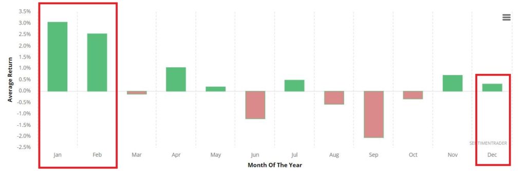
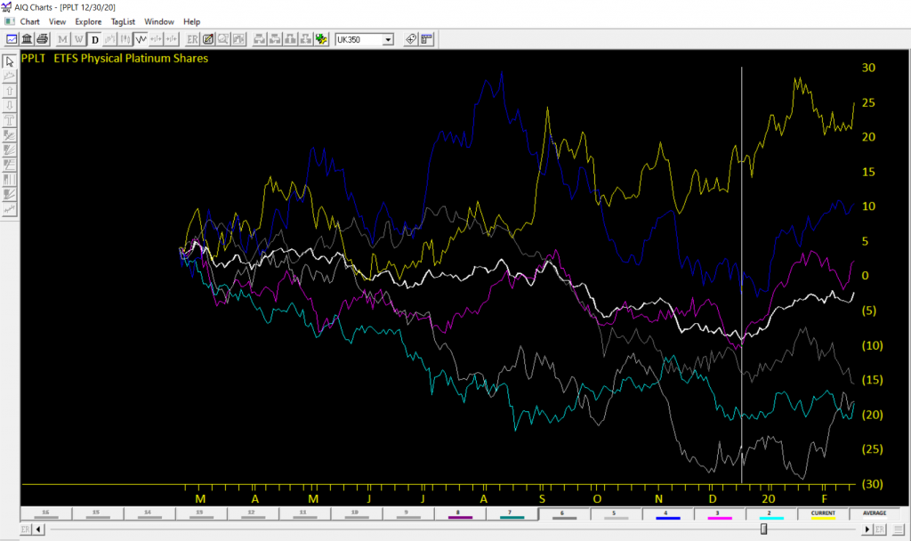
As you can see in Figure 1 from www.Sentimentrader.com below, January and February have historically been the best months for platinum.
And that is true if one looks at things on a calendar month basis. In this piece however, we are going to “cut things a little finer.”
Favorable Period for Platinum
For purposes of this piece, we will define the “Favorable Period” for platinum as:
*The 41 trading days (NOT calendar days) directly after the 13th trading day of December
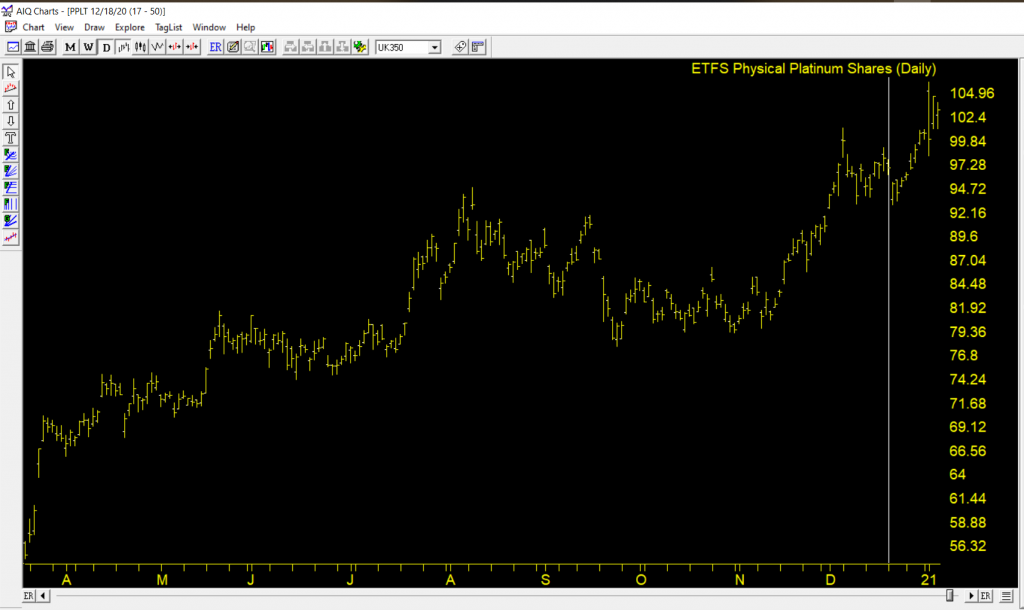
Technically this period in 2020 started at the close on 12/17/20 and will extend through the close of trading on 2/18/2021.
So far in 2020 it is “so far, not so good”. From the 12/17 close through the 12/24 close platinum has declined from roughly $1,054 and ounce to roughly $1,027.
So, does this mean that “it is not working this time around”? Or do we have a better buying opportunity now than we did on 12/17? The reality is that I can’t answer those questions. All I can do is highlight the history and let everyone else make up their own mind.
The History
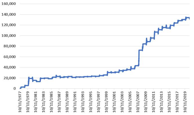
I have platinum futures historical data going back to October of 1977. So, we start our test in December 1977 and assume that a trader held a 1-lot of platinum futures (more on an ETF alternative later) every year during the “favorable period” defined above. Each full point movement for a platinum futures contract equals $50. So, if platinum futures advanced 10 points then the trader gains $500 and vice versa.
Figure 2 displays the cumulative hypothetical $ +(-) achieved by holding platinum ONLY during the favorable 41-day period every year.
Figure 2 – Cumulative $ +(-) for holding 1-lot of platinum futures during 41-day Favorable Period every year (1978-2020)
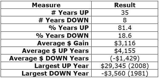
Figure 3 displays some relevant facts and figures.
Figure 3 – Facts and Figures
As you can see in Figures 2 and 3:
*This favorable 41 trading day period is “no sure thing”
*However, if you were going to bet on a direction during this period, the bullish side appears to be the better bet
An ETF Alternative
While the above is all very interesting on a theoretical basis, the reality is that a very low percentage of traders will ever touch a platinum futures contract (or should ever touch a platinum futures contract, given the inherent associated risks).
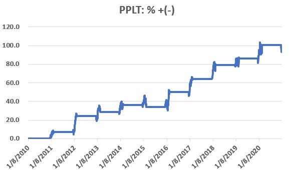
One alternative is to trade shares of ticker PPLT (Aberdeen Standard Physical Platinum Shares ETF). Figure 4 displays the cumulative hypothetical price return for PPLT ONLY during the 41-day favorable period since the ETF was created in 2010.
Figure 4 – Cumulative % + (-) for ticker PPLT during Favorable Period
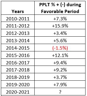
Figure 5 displays the year-by-year results for PPLT during the Favorable Period.
Figure 5 – PPLT %+(-) year-by-year during Favorable Period
During the 1st five trading days of this years “Favorable Period”, PPLT has declined -1.8%.
Summary
The good news about seasonal trends is that they can often afford you an “edge” in the markets. The bad news about seasonal trends is that you never know if a given trend will play out as expected “this time around” – so a certain leap of faith is required.
One’s choices regarding platinum between now and 2/28/2021 are:
*Bet a lot
*Bet a little
*Bet nothing at all
Choose wisely.
Jay Kaeppel
Editor’s note
In this AIQ Seasonality Chart we’ve plotted 6 years price action of PPLT through February 18, 2020 . The white line is the average of the 6 years and the vertical white is the starting point of the favorable period for each of the 6 years. The favorability of the period 12/17 to 2/18 is evident.
The current chart of PPLT shows the current gain from the favorable start date 12/17/20 at 96.99 to 1/6/21 at 103.22
Disclaimer: The information, opinions and ideas expressed herein are for informational and educational purposes only and are based on research conducted and presented solely by the author. The information presented represents the views of the author only and does not constitute a complete description of any investment service. In addition, nothing presented herein should be construed as investment advice, as an advertisement or offering of investment advisory services, or as an offer to sell or a solicitation to buy any security. The data presented herein were obtained from various third-party sources. While the data is believed to be reliable, no representation is made as to, and no responsibility, warranty or liability is accepted for the accuracy or completeness of such information. International investments are subject to additional risks such as currency fluctuations, political instability and the potential for illiquid markets. Past performance is no guarantee of future results. There is risk of loss in all trading. Back tested performance does not represent actual performance and should not be interpreted as an indication of such performance. Also, back tested performance results have certain inherent limitations and differs from actual performance because it is achieved with the benefit of hindsight.
OK, for the record, I have stood in enough long lines next to impossibly sweaty people (Full Disclosure: They likely feel the same way about me) to know that all of the talk of “Disney” and “Magic” is strictly for marketing consumption. That being said – and despite the fact that you cannot attend the flagship property in sunny CA, and likely will not be able to for some time – there is something about “going to Disney” that still strikes a chord with a whole lot of people.
Of course, my interest here is more financial in nature.
Now the “rational” thing to do in the minds of most investors is to ask and answer some serious questions regarding “theme park attendance.” in the age of COVID-19. Questions like “will attendance pick up anytime soon” and “will DIS continue to be an economic powerhouse if attendance does not return to pre-Covid levels?”
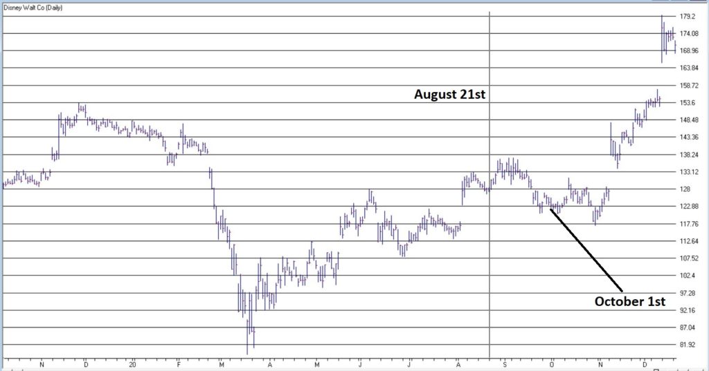
Here is a link to a factual, well-researched and well-written article noting that Disney World attendance as of 8/21/20, attendance was down 80% from a year earlier. Scary stuff, right? And the snap implication is fairly obvious – theme parks are suffering and may continue to do so for the foreseeable future.
But as I mentioned, my interest is more financial in nature. And I tend to look at things from a slightly different angle than a lot of other people. Part of that is because I have come to recognize that (like a lot of other people, but sadly unbeknownst to a lot of those same people) I (and they) am not very good at accurately answering “questions about the future”, such as those posed above about theme parks.
I read that theme park attendance is “down 80%” and instantly that voice in my head loudly issues that age-old “DANGER! WARNING WILL ROBINSON” alert and I feel the urge to scurry off in the other direction. But fortunately, I have gotten pretty good at not overreacting to that initial warning and coming back for a second glance.
Consider Figure 1. The date marked by the vertical line is August 21, 2020, i.e., the day that the news came out that “Disney World attendance is down 80%, that heavy discounting going on, that Disney stock is down for the year and that it is lagging the major stock indexes.”
Since that “DANGER! WARNING WILL ROBNINSON” moment, DIS is up +34% in 4 months, versus +9% for the S&P 500 Index (FYI, DIS is now up 18% for 2020 vs. 14%+ for the S&P 500).
Are the financial markets a perverse beast, or WHAT!?
The “Real Magic” of Disney Stock
So, what the heck happened to make DIS stock burst higher even in the face of seemingly very bad fundamental news? Well, long story short, October 1st happened. Wait, what? October 1st? Surely it can’t be that simple!?
Here’s the thing: it probably should not be that simple. And there is absolutely no guarantee that it will continue to be that simple. But for the past roughly 6 decades…. it has been just about that simple. Consider Figure 2.
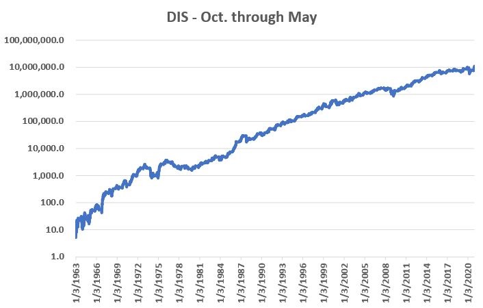
Figure 2 displays the cumulative % gain for DIS stock held ONLY from October 1st each year through the end of May the following year, every year since 1962.
Figure 2 – DIS % +(-) during October through May (logarithmic scale)
An initial $1,000 investment in DIS stock held only October through May starting in 1962 is worth $108,512,237 as of 12/18/2020, or a gain of +10,851,124%.
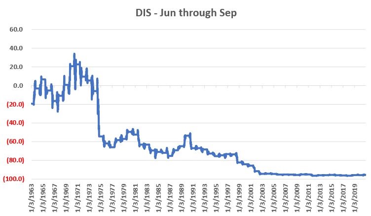
Figure 3 displays the cumulative % gain for DIS stock held ONLY from June 1st each year through the end of September that same year, every year since 1962.
Figure 3 – DIS % +(-) during June through September (non-logarithmic scale)
An initial $1,000 investment in DIS stock held only June through September starting in 1962 is worth $44.86 as of 12/18/2020, or a loss of -95.5%.
The Upshot
Many investors will ask the obvious question of “Why does this work?” And the most succinct answer I can proffer is “It beats me.” Obviously, many investors will not be satisfied with that answer. And that is perfectly OK by me. As a proud graduate of “The School of Whatever Works” I tend to value “consistency” more than I do cause and effect. Not everyone is wired that way and that’s OK.
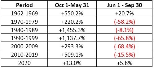
Speaking of consistency, for what it is worth Figure 4 displays decade-by-decade results for the Oct-May period versus the Jun-Sep period.
Figure 4 – DIS decade-by-decade
The key things to note are that:
*The Oct-May period showed a pretty substantial gain during each of the 6 previous decades.
*The Jun-Sep period showed a gain during the 60’s but lost money in every subsequent decade
(Note 2020 results through 12/18 are included in the table but are not a part of the commentary above).
Summary
Clearly the Oct-May period has been pretty “magical” for DIS stock investors for a long time. Will this continue to be the case in the future? Ah, there’s the rub. And as always, I must repeat once again my stock answer of “It beat’s me.”
But the real point is that in the long run investment success has a lot to do with finding and “edge” and exploiting it repeatedly. Or as I like to say:
“Opportunity is where you find it.”
See also Jay Kaeppel Interview in July 2020 issue of Technical Analysis of Stocks and Commodities magazine
Disclaimer: The information, opinions and ideas expressed herein are for informational and educational purposes only and are based on research conducted and presented solely by the author. The information presented represents the views of the author only and does not constitute a complete description of any investment service. In addition, nothing presented herein should be construed as investment advice, as an advertisement or offering of investment advisory services, or as an offer to sell or a solicitation to buy any security. The data presented herein were obtained from various third-party sources. While the data is believed to be reliable, no representation is made as to, and no responsibility, warranty or liability is accepted for the accuracy or completeness of such information. International investments are subject to additional risks such as currency fluctuations, political instability and the potential for illiquid markets. Past performance is no guarantee of future results. There is risk of loss in all trading. Back tested performance does not represent actual performance and should not be interpreted as an indication of such performance. Also, back tested performance results have certain inherent limitations and differs from actual performance because it is achieved with the benefit of hindsight.
Over the last month the stock and bond markets have increased again. November has been one of the best months for all of the indexes not just the technology sector. The small and midcap stocks started to pick up steam last month, rising over 10% as compared to the 2 to 4% on the Dow, S&P and NASDAQ. I continue to like the small and midcap funds as well as the value sector especially as the vaccine application gets even closer. We are still in a seasonally strong time for the market, but the senate elections in January may cause volatility depending on the results. My computer models are still on a Buy-Hold signal but can change at anytime.
One year from now I expect the economy to be better than it is currently with the vaccine now being administered by Pfizer and other companies. This should benefit the hard hit restaurants, airlines, parks, and more. If you are within 1 to 3 years of your retirement I would rebalance your portfolio, as the markets have done well and are about 10% overvalued. If you haven’t had a strategy meeting with me in the last 6 months please call me to set a time to go over all of your holdings holistically, including your 401(k) and more.
Some of the INDEXES of the markets both equities and interest rates are below. The source is Morningstar.com up until December 12, 2020. These are passive indexes.
YTD Dow Jones +7.8% S&P 500 +15.% EQUAL WEIGHTED S&P 500 +10.7% NASDAQ Aggressive growth +31% Large Cap Value +3.0% I Shares Russell 2000 ETF (IWM) Small cap +16% Midcap stock funds +10% International Index (MSCI – EAFE ex USA +6% Financial stocks -5% Energy stocks -28% Healthcare Stocks +11%
Moderate Mutual Fund Investment Grade Bonds (AAA) Long duration +9.8% High Yield Merrill Lynch High Yield Index +3.%
Floating Rate Bond Funds +1.2% Short Term Bond +3.2% Mutli sector bond funds +4.17%
Classicalprinicples.com and Robert Genetskis Excerpts
Market Outlook
The bull market in stocks continues. All five of the indexes are now at or within 1% of all-time highs. Small cap ETFs (!WM, IJR) were up close to 4%, the QQQ’s were up 3%, while the Nasdaq, S&P500 and Dow were flat to only slightly higher. The news for the week was mostly positive. While most are focusing on FDA’s approval of Pfizer’s vaccine, something even better may be coming along (See the Covid update on bottom of page.) The S&P500 remains 10% overvalued and most psychological indicators point to excessive bullishness. It would not be unusual for stocks to pull back from these levels. Even so, technical indicators remain positive. In addition, the tailwind from the Fed buying close to $100 billion a month suggests the bull market can continue. I remain comfortable with a recommended exposure of 90% equities and 10% cash in a standard portfolio. Individual exposure to stocks depends on individual characteristics.
A Look Back
Weekly initial unemployment claims increased to 853,000 in the first week of December. The 4- week average also increased to 776,000, up from 746,000 in November. The number of workers receiving insured unemployment payments increased 300,000 to 5.8 million, but down from 7 million a month ago. The insured unemployment rate was 3.9 million down from 5.0 million a month ago. Inflation data continue to be distorted by the volatile shift from lockdown to recovery. In the 6 months ending in November consumer prices were up at roughly a high 3½% annual rate. However, year-over-year consumer inflation remains a modest 1½%.
As Covid deaths are recording new daily records, there is a heightened level of fear over the trend. There is also concern the rise in new cases and deaths will slow the economic recovery. In spite of complaints about a person without a medical degree passing along information on Covid treatments, I will continue to inform you about what I believe is credible information. You should be able to evaluate and decide for yourself if such information could be useful to you and your family and friends. Three days ago, Dr. Pierre Kory, head of an international association of doctors specializing in treating Covid patients, testified before Congress. His group of doctors claims they now have a protocol that provides the most effective means of both preventing and treating Covid. Dr. Kory says no one needs to be infected or die from Covid any longer. The protocol uses Ivermectin Oral, a widely used medicine for treating parasites. Dr. Kory’s group says it is safe and inexpensive.
Source: Classical Principles.com
The S&P 500 is above. As you can see, the November to December time period went up nicely, but over the last few days the market has become tired and unless we get a stimulus package that will excite the market, we may see a pullback to the 3551 to the 3604 level. If that level breaks decisively then there is no real support until it gets to 3357 or the 200 day moving average. I don’t see more volatility than that as we are currently on a Buy-Hold in this market.
The first indicator is the MACD or the Moving Average Covergence Divergence indicator. The Buys and Sells are given when the indicators cross. This daily indicator is more for shorter term trades. On the weekly chart the MACD is still positive.
The SK-SD Stochastics indicator. I use this indictor to determine when the market is overbought or oversold. When the markets are dramatically over bought, OVER 88, you might want to reduce equities some what and when it’s under 40 you may want to accumulate equities. It is above 88 and crossed on the downside, so be a little careful short term.
The Stochastics indicator. The Buys are given when the indicator goes below 20 and then rises above 20 and the Sells are given when the indicator drops below 80 and it just did. Even though the LONG TERM signals are still positive, the Short term may be a little volatile. If the US Governement has another stimulus program the market can again rise.
Support levels
S&P 500 area are 3636, 3550, 3357 and 3209. NASDAQ Support, 12075, 11970, 11749 and 11369. Dow Jones 29970, 29564, 28837, 28474, and 26146 These may be safer areas to get into the equity markets on support levels slowly on the accumulation areas.
THE BOTTOM LINE:
The market has continued nicely over the last month mainly because of earnings of companies beating expectations and a recognition that the economy will eventually return to a growth pattern. The market looks to continue to grow and as the economy comes out of its recession, the small and midcap stocks as well as the large stocks should continue to do well over the next few years. The NASDAQ has done the best this year and should continue to do well IF the market continues higher. Now that the vaccine is a reality the value stocks should start to rise. I like the international stocks as well. Diversification is now important as the first 5 months of the recovery has been all large growth.
Joe Bartosiewicz, CFP® 92 High Street Thomaston, CT 06787 860-940-7020
Securities and advisory services offered through SagePoint Financial, Inc. (SPF), member FINRA/SIPC. SPF is separately owned and other entities and/or marketing names, products or services referenced here are independent of SPF. 800-552-3319 20 East Thomas Road Ste 2000 Phoenix AZ 85012
Technical Analysis is based on a study of historical price movements and past trend patterns. There is no assurance that these market changes or trends can or will be duplicated shortly. It logically follows that historical precedent does not guarantee future results. Conclusions expressed in the Technical Analysis section are personal opinions: and may not be construed as recommendations to buy or sell anything.
Disclaimer: The views expressed are not necessarily the view of Sage Point Financial, Inc. and should not be interpreted directly or indirectly as an offer to buy or sell any securities mentioned herein. Securities and Advisory services offered through Sage Point Financial Inc., Member FINRA/SIPC, an SEC-registered investment advisor.
Past performance cannot guarantee future results. Investing involves risk, including the potential loss of principal. No investment strategy can guarantee a profit or protect against loss in periods of declining values. Please note that individual situations can vary. Therefore, the information presented in this letter should only be relied upon when coordinated with individual professional advice. *There is no guarantee that a diversified portfolio will outperform a non-diversified portfolio in any given market environment. No investment strategy, such as asset allocation, can guarantee a profit or protect against loss in periods of declining values. It is our goal to help investors by identifying changing market conditions. However, investors should be aware that no investment advisor can accurately predict all of the changes that may occur in the market.
The price of commodities is subject to substantial price fluctuations of short periods and may be affected by unpredictable international monetary and political policies. The market for commodities is widely unregulated, and concentrated investing may lead to Sector investing may involve a greater degree of risk than investments with broader diversification.
Indexes cannot be invested indirectly, are unmanaged, and do not incur management fees, costs, and expenses.
Dow Jones Industrial Average: A weighted price average of 30 significant stocks traded on the New York Stock Exchange and the NASDAQ.
S&P 500: The S&P 500 is an unmanaged indexed comprised of 500 widely held securities considered to be representative of the stock market in general.
NASDAQ: the NASDAQ Composite Index is an unmanaged, market-weighted index of all over the counter common stocks traded on the National Association of Securities Dealers Automated Quotation System
(IWM) I Shares Russell 2000 ETF: Which tracks the Russell 2000 index: which measures the performance of the small capitalization sector of the U.S. equity market.
A Moderate Mutual Fund risk mutual has approximately 50-70% of its portfolio in different equities, from growth, income stocks, international and emerging markets stocks to 30-50% of its portfolio in different categories of bonds and cash. It seeks capital appreciation with a low to moderate level of current income.
The Merrill Lynch High Yield Master Index: A broad-based measure of the performance of non-investment grade US Bonds
MSCI EAFE: the MSCI EAFE Index (Morgan Stanley Capital International Europe, Australia, and Far East Index) is a widely recognized benchmark of non-US markets. It is an unmanaged index composed of a sample of companies’ representative of the market structure of 20 European and Pacific Basin countries and includes reinvestment of all dividends.
Investment grade bond index: The S&P 500 Investment-grade corporate bond index, a sub-index of the S&P 500 Bond Index, seeks to measure the performance of the US corporate debt issued by constituents in the S&P 500 with an investment-grade rating. The S&P 500 Bond index is designed to be a corporate-bond counterpart to the S&P 500, which is widely regarded as the best single gauge of large-cap US equities.
Floating Rate Bond Index is a rule-based, market-value weighted index engineered to measure the performance and characteristics of floating-rate coupon U.S. Treasuries, which have a maturity greater than 12 months.
*”Every situation in life represents an opportunity”
*”Opportunity is where you find it”
Nowhere is this truer than in the financial markets.
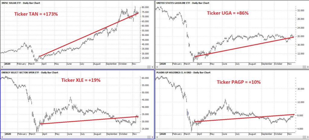
To wit, in this article dated 3/26/2020 (cue the scary music) – when things looked their absolute worst – I highlighted four tickers in the energy sector (yes, THAT energy sector, the one that has been a disaster and loathed and unloved for some time now). Now it would have taken a true “Buy when there is blood in the streets” mentality, and/or almost foolhardy nerves of steel to actually pile into those issues at the time.
But that is sort of the point.
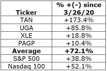
Figure 1 displays the tickers and their price action since the close on 3/26/2020.
Figure 2 displays the comparative performance versus the S&P 500 and the Nasdaq 100.
Figure 2 – “Blood in the Streets” energy stocks versus major indexes
As you can see in Figure 2 these four stocks as a whole have actually outperformed both the S&P 500 Index and the Nasdaq 100 Index.
Now the point IS NOT that I am some great stock-picker (because I am not). The point is that, well, see the two quotes above.
A Broader Look at Energy
For someone with less of the “buy when there is blood in the streets” mentality and more of “trend-following” mentality, a simple trend-following method may soon (at long last) swing to the bullish side.
It works like this:
*Two “tickers” see their respective 5-week average cross above their respective 30-week average
*Ticker 1 is ticker XLE (the SPDR energy ETF)
*Ticker 2 is an index (I created) of securities that have an inverse correlation to the U.S. Dollar
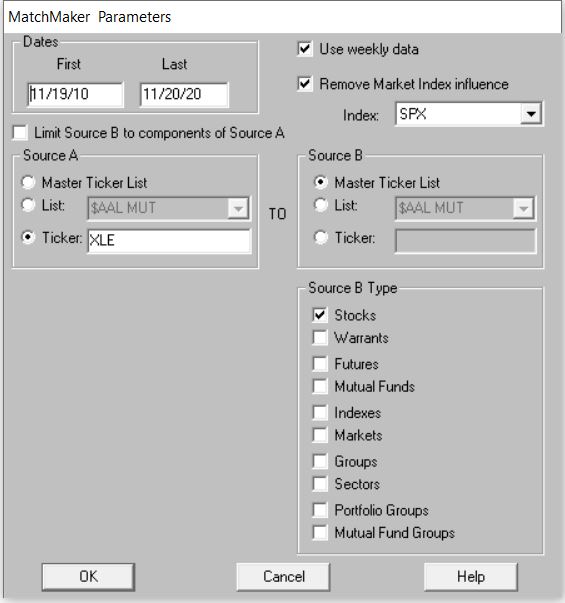
Editors Note: To create an inverse index of the ticker XLE, you’ll first need to use the Matchmaker tool and run a correlation between XLE and your database of stocks. The stocks that correlate the least with have the highest negative correlation.
To create the index. Make a new list in AIQ Data Manager, create a new group ticker called ANTIUS3 and add it to the list. Add the least correlated tickers from Matchmaker to this group, then use Compute Group/Sector Indices to compute all dates for this list. You’ll now have an equivalent to the ANTIUS3.
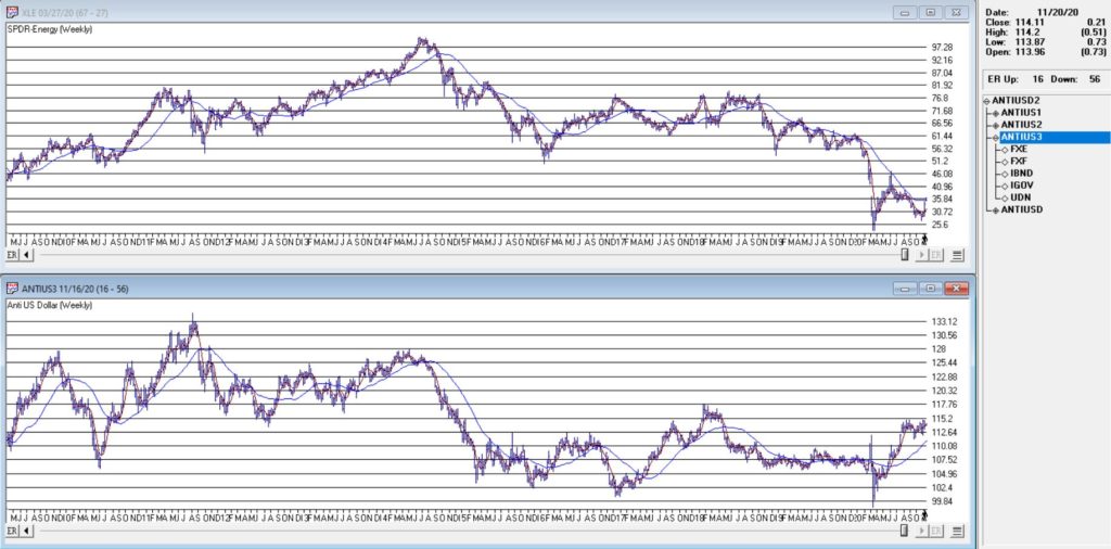
You can see these two – along with their respective 5-week and 30-week – in Figure 3.
As you can see in Figure 3 the two have a tendency to often move together. At other times they do not. The key point here is that we ONLY pay attention when the two tickers are both trending in the same direction.
Why is this important?
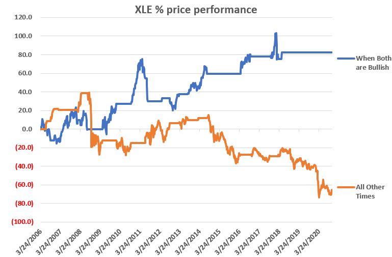
Figure 4 displays the cumulative price growth for ticker XLE (as a proxy for the broad energy sector) under two separate circumstance:
*When BOTH XLE and ANTIUS3 are in uptrends (i.e., 5-week average ABOVE 30-week average)
*When EITHER XLE or ANTIUS3 is NOT in an uptrend (i.e., 5-week average BELOW 30-week average)
Figure 4 – XLE cumulative %+(-) depending on trend status for XLE and ANTIUS3
To put it in numbers:
When BOTH are in Uptrends: XLE = +82.3%
When EITHER is NOT in an Uptrend: XLE = -65.5%
Summary
Another glance at Figure 1 reveals that ANTIUS3 is in an uptrend and that XLE is not quite there yet. So, at the moment there is no bullish signal from the method described above. However, energy does appear to be “trying” to rally. Investors looking for “opportunity” may be wise to keep an eye on the 5-week and 30-week averages of ticker XLE in the weeks and month ahead.
See also Jay Kaeppel Interview in July 2020 issue of Technical Analysis of Stocks and Commodities magazine
Disclaimer: The information, opinions and ideas expressed herein are for informational and educational purposes only and are based on research conducted and presented solely by the author. The information presented represents the views of the author only and does not constitute a complete description of any investment service. In addition, nothing presented herein should be construed as investment advice, as an advertisement or offering of investment advisory services, or as an offer to sell or a solicitation to buy any security. The data presented herein were obtained from various third-party sources. While the data is believed to be reliable, no representation is made as to, and no responsibility, warranty or liability is accepted for the accuracy or completeness of such information. International investments are subject to additional risks such as currency fluctuations, political instability and the potential for illiquid markets. Past performance is no guarantee of future results. There is risk of loss in all trading. Back tested performance does not represent actual performance and should not be interpreted as an indication of such performance. Also, back tested performance results have certain inherent limitations and differs from actual performance because it is achieved with the benefit of hindsight.
Over the last month, the stock markets continue to climb 2-5%, but they are not at the highs seen in the beginning of September when my computer models gave us a Sell signal. Two weeks ago My AIQ models went on 2 Buy signals and are currently on a Buy-Hold signal. The markets are now again fairly valued and somewhat overvalued mainly due to the 30 largest technology stocks that have gone up 100-500% this year. These stocks are skewing the market averages to the upside and making you believe the markets are doing better than they actually are as a whole. The bond markets are up slightly over the last month.
Many people have asked me what a Biden election would do for the the stock market. THE MARKET knows what to expect from President Donald Trump: business-friendly policies, less regulation, tariffs on imports – generally, the forces that have helped define the Trump stock market. But a few weeks out from the election, Democratic presidential nominee Joe Biden is up in the polls. So, what will happen to the stock market if Biden wins the general election this year?
First, it’s not about whether Biden wins or Trump wins. It’s also about who takes the Congress; if the Senate or House or both go Republican, then that could frustrate Biden’s agenda quite a bit. And Trump, if the Biden wins. Trumps policies are lower taxes for corporations and high net individuals and Bidens are to repeal those tax benefits. This could lead to lower corporate profits and lower earnings and lower stock prices. A Biden win could have positive benefits for Solar, wind and infrastructure companies. Overall, The increased tax rates will result in lower profits and likely lower share prices. This effect may be more than offset by a larger fiscal stimulus package passed by Congress and better trade relations with countries in Europe as well as with China. We will see what happens. If you are concerned about the direction of the markets after the election please call me over the next week to discuss your portfolio and how it may affect you. Remember, Biden is ahead on the polls and the market continues to rise. Why? Because earnings are continuing to rise and next year the economy should perfrom much better than it is doing currently. We are also going into seasonal strength from November to January. But I do expect potential major volatility over the next few months.
Some of the INDEXES of the markets both equities and interest rates are below. The source is Morningstar.com up until October 16, 2020. These are passive indexes. Most of you are in mutual funds and this is not a representation of your investments. Yours can be higher or lower depending on your risk tolerance and financial goal objectives.
Dow Jones +2.0% S&P 500 +9.0% EQUAL WEIGHTED S&P 500 -3.0% NASDAQ Aggressive growth +28% Large Cap Value -7.0% I Shares Russell 2000 ETF (IWM) Small cap -1.0% Midcap stock funds -9 to -2% International Index (MSCI – EAFE ex USA -5% Financial stocks -17% Energy stocks -34% Healthcare Stocks +7% Moderate Mutual Fund Investment Grade Bonds (AAA) Long duration +3% High Yield Merrill Lynch High Yield Index +4% Floating Rate Bond Funds -1.6% Short Term Bond +1.% Fixed Bond Yields (10 year) .6% Yield
As you can see above, the only stock sectors that are benefitting are the companies benefitting by people being at home, from Zoom, to Amazon, to Facebook, gaming and more. Retail, manufacturing, airlines, value stocks, dividend stacks and many more are all down for the year.
Classicalprinicples.com and Robert Genetskis Excerpts:
Stocks were higher this past week with the Nasdaq and QQQs up 3%. Other major indexes were up 1⁄4% to 3⁄4%. There was little in the way of economic news to move markets. Earnings reports are just getting under way. My estimate is for S&P500 operating earnings of $30, up 23% from the second quarter but down 17% from a year ago. On balance, third quarter earnings reports should be a positive for stocks. Moreover, with the economy continuing to show signs of a strong recovery, investors should continue to anticipate a further recovery in earnings. In spite of the polls showing voters are likely to place Biden and Harris in charge of the nation’s policies, I continue to expect another four years of classical economic principles. In a democracy, the people get to choose which set of policies they’ll live under. I’m convinced voters will opt to continue the current set of policies.
A Look Back
Today’s report shows retail sales soared 2% in September. This brought quarterly sales 131⁄2% higher than the second quarter and up more than 5% from a year ago. The economy is close to having made a full recovery from its government- imposed shutdown. There is no need for another massive “stimulus” program, which would do more harm than good.
Weekly employment numbers continue to provide mixed signals. While weekly initial unemployment claims moved higher, insured unemployment payments and the insured unemployment ratescontinue to decline. Weekly initial unemployment claims increased close to 900,000 in the week of October 10th, up slightly from September’s average of 866,000. In contrast, the number of insured unemployment data show 10 million people received payments in the first week in October. This was down 21⁄2 million than at the beginning of September.
Despite concerns over a weak recovery, the S&P500 reached my estimate of fair value. In contrast, the Nasdaq has far exceeded all prior measures of reasonable valuation. How can stocks rise with the economy so weak? There are two reasons. First, the economy is not weak. It continues to recover rapidly. Second, monetary policy is more expansive than at any time in history.
Although stocks are either fully-valued or over-valued, they can still go higher. At this point, I’m comfortable continuing to ride the wave higher while holding 10% cash for use when the market corrects. Stay cautiously bullish.
Friday’s employment report shows a gain of 1.5 million private-sector workers in early July. The number of unemployed remains high at 16 million. The good news is that weekly unemployment insurance claims continued to improve through the end of July.
The ISM surveys of manufacturers and service companies also show employment contracting. However, these surveys show a strong surge in new orders, which will lead to an increase in jobs in August.
There are reasons why unemployment remains high. Given the uncertainty over the outlook, it’s natural to await new orders before hiring. Also, employers need to trim unessential costs to pay for the increased costs associated with the virus.
Finally, government payments not to work have appealed to many.
Source: Classical Principles.com
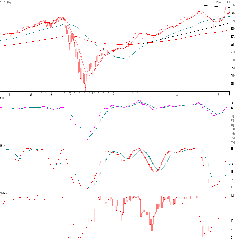
S&P 500 Chart Source: AIQsystems.com
The S&P 500 is above. As you can see the S&P 500 is about 2.5% above the old high hit in February 2020. The major reason is because the tech stocks like Apple, Tesla, Microsoft and the tech stocks continue to hit new highs while the value stocks and the dividend stocks continue to falter.
Remember, most stocks are down for the year. There is Buying Support at the OLD High of 3393 about 3% lower than where we are now and support at the Trend line of 3300. On the upside 3546 would be considered a breakout and positive. So, if there is a breakdown of the stock market over the next few weeks, 3393 will be a test. If my computer models go to a SELL signal and the S&P closes below 3393 I would raise cash and if the S&P 500 closes below the the Trendline currently 3300, I would raise more cash even though I think the economy will do better next year.
The first indicator under the price chart is the MACD or Moving Average Converge Divergence. It’s a measure of momentum When the Pink line crosses the blue line on the upside, then momentum and the markets look good and when they break on the downside we have to be more cautious. Currently things are ok.
The third graph is the level of markets being overbought and oversold. Currently the market is getting near a point where it is getting a little overbought. A few more positive days in the market and we will be very overbought.
The last graph is Stochastics. If the line rises above the 80 line as it currently is the market is getting somewhat overbought but it can stay like that for a while.
So we are getting over bought somewhat, the market can go higher from here but if it closes below the two support levels above I would get more Cautious.
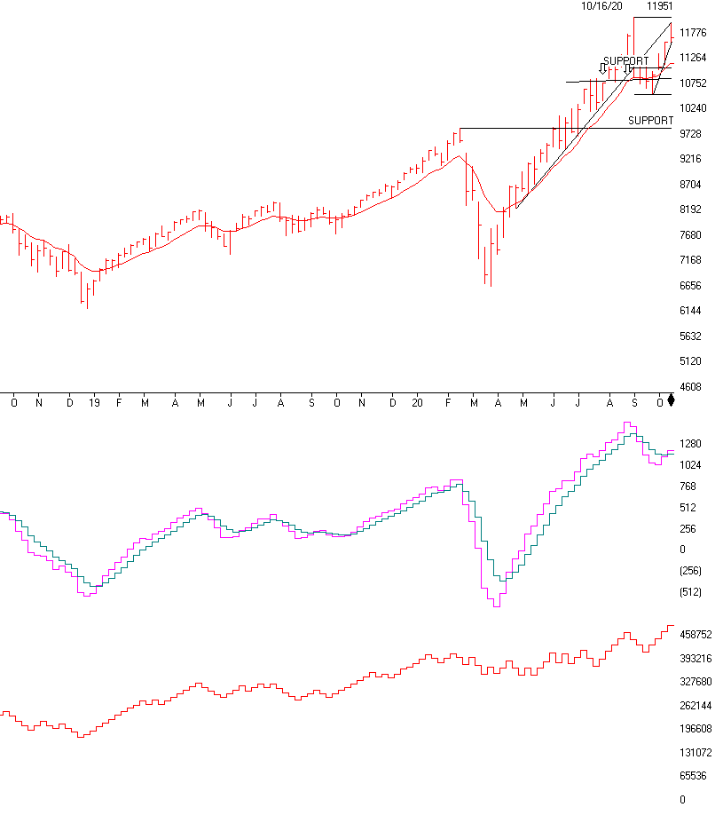
The NASDAQ (WEEKLY CHART) is above. It represents the best in the COVID sector, Apple, ZOOM, Amzon, Activison, Microsoft, Shopify, Google, Facebook and more. These stocks are benefitting substantially by people staying at home. This sector will cool down when the vaccine becomes available, safe and effective. Up until that time the NASDAQ could do relatively better than the value sector or the manufacturing, financials, retail, airlines etc. There is a caveat that could happen and that is the technical break of the support levels. To the left is the TRENDLINE, notice it is again going straight up. It is approaching the old high of 12032. It’s cuurently at 11,671 about 2.5% below its old high. We will watch it daily, but if the NASDAQ closes below 11.593, currently, then it will have broken and close below a weekly and daily Trendline, at this point I would start to raise a little cash, because the NASDAQ is very overbought and could easily fall 5 – 10 % over the next month or two. We need to do our technical analysis daily. Currently, things look good, but we need to keep our eye on all situations going into the election. One year from now and longer term I think the global economy will do much better than it is now. But short term I am still concerned about the election and the future technical situation.
MACD or Moving Average Convergence Divergance or Momentum broke out to the upside and still looks ok. But if it breaks on the downside I will be more concerned. Currently, my computer models are not on a Sell, but it needs to be watched closely, especially now.
On Balance Voume is confirming the upside of the NASDAQ, this is a positive indicator that the NASDAQ should conitune on the upside, but things change quickly.
Chart Source:AIQsystems.com
Support levels on the S&P 500 area are 3458, 3392, 3306. 3544 is resistance.
NASDAQ Support, 11593, 11292, 11062, 10793, 10524 and 9,841
These may be safer areas to get into the equity markets on support levels slowly on the accumulation areas.
THE BOTTOM LINE:
The market has rebounded nicely over the last month mainly because of earnings of companies beating expectations. The NASDAQ has done the best and should continue to do well IF the market continues higher. Once the vaccine become closer to a reality the value stocks should start to rise. But up until that time the large, mid and small growth stocks could continue to dominate. You may want to call me to review everything including your 401(k) to determine the best allocation going forward. There is a major trend-line right below the markets, see above. If those are broken on a Close I will get Cautious to Very Cautious. It is important for the trendlines and the 50 day moving average to hold or it could start a correction. I like the USA market better than the international market.
Best to all of you,
Joe Bartosiewicz, CFP® Investment Advisor Representative 92 High Street Thomaston, CT 06787 860-940-7020
Technical Analysis is based on a study of historical price movements and past trend patterns. There is no assurance that these market changes or trends can or will be duplicated shortly. It logically follows that historical precedent does not guarantee future results. Conclusions expressed in the Technical Analysis section are personal opinions: and may not be construed as recommendations to buy or sell anything.
Disclaimer: The views expressed are not necessarily the view of Sage Point Financial, Inc. and should not be interpreted directly or indirectly as an offer to buy or sell any securities mentioned herein. Securities and Advisory services offered through Sage Point Financial Inc., Member FINRA/SIPC, an SEC-registered investment advisor. Past performance cannot guarantee future results. Investing involves risk, including the potential loss of principal. No investment strategy can guarantee a profit or protect against loss in periods of declining values. Please note that individual situations can vary. Therefore, the information presented in this letter should only be relied upon when coordinated with individual professional advice. *There is no guarantee that a diversified portfolio will outperform a non-diversified portfolio in any given market environment. No investment strategy, such as asset allocation, can guarantee a profit or protect against loss in periods of declining values. It is our goal to help investors by identifying changing market conditions. However, investors should be aware that no investment advisor can accurately predict all of the changes that may occur in the market. The price of commodities is subject to substantial price fluctuations of short periods and may be affected by unpredictable international monetary and political policies. The market for commodities is widely unregulated, and concentrated investing may lead to Sector investing may involve a greater degree of risk than investments with broader diversification. Indexes cannot be invested indirectly, are unmanaged, and do not incur management fees, costs, and expenses. Dow Jones Industrial Average: A weighted price average of 30 significant stocks traded on the New York Stock Exchange and the NASDAQ. S&P 500: The S&P 500 is an unmanaged indexed comprised of 500 widely held securities considered to be representative of the stock market in general. NASDAQ: the NASDAQ Composite Index is an unmanaged, market-weighted index of all over the counter common stocks traded on the National Association of Securities Dealers Automated Quotation System (IWM) I Shares Russell 2000 ETF: Which tracks the Russell 2000 index: which measures the performance of the small capitalization sector of the U.S. equity market. A Moderate Mutual Fund risk mutual has approximately 50-70% of its portfolio in different equities, from growth, income stocks, international and emerging markets stocks to 30-50% of its portfolio in different categories of bonds and cash. It seeks capital appreciation with a low to moderate level of current income. The Merrill Lynch High Yield Master Index: A broad-based measure of the performance of non-investment grade US Bonds MSCI EAFE: the MSCI EAFE Index (Morgan Stanley Capital International Europe, Australia, and Far East Index) is a widely recognized benchmark of non-US markets. It is an unmanaged index composed of a sample of companies’ representative of the market structure of 20 European and Pacific Basin countries and includes reinvestment of all dividends. Investment grade bond index: The S&P 500 Investment-grade corporate bond index, a sub-index of the S&P 500 Bond Index, seeks to measure the performance of the US corporate debt issued by constituents in the S&P 500 with an investment-grade rating. The S&P 500 Bond index is designed to be a corporate-bond counterpart to the S&P 500, which is widely regarded as the best single gauge of large-cap US equities. Floating Rate Bond Index is a rule-based, market-value weighted index engineered to measure the performance and characteristics of floating-rate coupon U.S. Treasuries, which have a maturity greater than 12 months.